Santa Barbara Public Library: Tympanum above Southwest Entrance
Introduction
Text-to-speech Audio
We're standing outside the main entrance of the Santa Barbara central public library on the southwest corner of Anapamu and Anacapa streets. If you're a Santa Barbara resident, you've probably walked past this door countless times without ever looking up! The library was built in 1917 thanks to a $50,000 grant from Andrew Carnegie who funded the construction of over 1600 libraries in the United States. This semi-circular decoration above the doors is called a tympanum and this particular tympanum is one of most unique architectural elements in our city. It was designed in 1924 by the architect, Carleton Winslow, who was a key proponent of Spanish Colonial Revival architecture in Southern California. If you didn't know this was the entrance to a library, your first thought might be that you were about to walk into a church or some kind of ancient monumental building. That's because Carleton Winslow and other architects of early 20th century Santa Barbara were heavily influenced by historic European and classical architecture.
Images
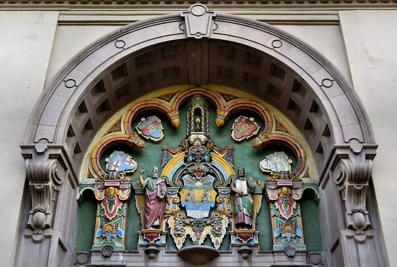
Tympanum above the southwest portal of the Santa Barbara Central Public Library

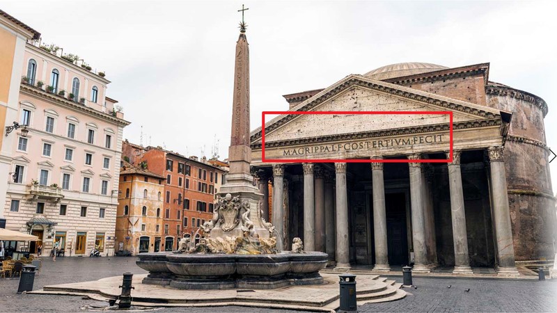
The Pantheon, Rome (27 BC) is a former Roman temple, now a Catholic church The history of the tympanum as an architectural element goes back to the days of ancient Greece. It was then adopted by the ancient Romans for all kinds of civic monuments and became a prominent feature of medieval European churches. So this decorative space of the tympanum has been used for thousands of years to convey important messages to the public. Wealthy Greeks and Romans were expected to fund the construction of public buildings like temples and bath houses, and they let everyone know who paid for them by displaying their names prominently above the entrance. This inscription reads, “M[arcus] Agrippa L[ucii] f[ilius] co[n]s[ul] tertium fecti,” meaning “Marcus Agrippa, son of Lucius, made [this building] when consul for the third time.”

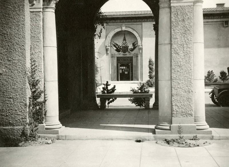
Santa Barbara Public Library, 40 East Anapamu St., Main library entrance during war days, Mr. Clarence Black gave the Allied flags for the decoration over the door, 1918, photo taken from courtyard of the Presbyterian Church. Edson Smith Photo Collection no. 488 The original design included a tympanum (though one different than what we have now), but upon opening the Library in August 1917 and in the midst of WW1, funds were limited. In the interim these Allied Flags, owned by Clarence Black who donated the land for the library, were displayed. A big thank you to Jace Turner, librarian at the Santa Barbara Public Library, who generously shared this rare photo from the library's Edson Smith Collection and supplied the caption.

Backstory and Context
Text-to-speech Audio
The history of the tympanum as an architectural element goes back to the days of ancient Greece. It was then adopted by the ancient Romans for all kinds of civic monuments and became a prominent feature of medieval European churches. So this decorative space of the tympanum has been used for thousands of years to convey important messages to the public. Wealthy Greeks and Romans were expected to fund the construction of public buildings like temples and bath houses, and they let everyone know who paid for them by displaying their names prominently above the entrance. In the middle ages, the church tympanum was used to convey messages of a different sort: scenes of the last judgment and other biblical events sent a clear message to medieval Catholics that the intercession of the clergy was their only path to salvation.
If tympana are traditionally used for communicating messages, what does this one tell us?
The central element is the Coat of Arms for the City of Santa Barbara, which features two Spanish galleons sailing the ocean. These rolling green hills represent the Santa Ynez Mountain range, while the rising sun likely signals the dawning of Spain's new age of colonization. We can see the words: "The City of Santa Barbara" written in Latin.
The two central figures on either side are Plato and Aristotle, both identified by their names in Greek below. Here, they represent philosophy in its most traditional sense: the love of learning. A perfect theme for a library. On the left stands an elderly Plato, pointing to the heavens in reference to his Theory of Forms. This philosophy, which you might have encountered in Plato’s famous “Allegory of the Cave,” asserts that the physical world is not really the 'real' world; instead, ultimate reality exists beyond our physical world and everything we see is just an imitation. Aristotle, Plato’s young student, stands on the right displaying a book. This likely refers to his belief that knowledge comes from experience. Empiricism, as it is known, theorizes that humans must have concrete evidence to support their ideas and is very much grounded in the physical world.
The stance of these two ancient Greek philosophers might look familiar to you: that's because Winslow's design intentionally references Raphael's famous painting "The School of Athens" from 1510, which decorated Pope Julius II's personal library in the Vatican Palace.
The library's tympanum is reset, with shields for four other famous European libraries installed along these scalloped arches. From the left, we can see the shield for the University of Bologna (Italy), the Bibliotheque National in Paris, the University of Salamanca (Spain), and the Bodleian Library at Oxford University in England - all established respectively in the 11th, 15th, 12th, and 17th centuries.
You can see that Winslow also incorporated other elements of Raphael's painting: here we can see an imitation of the coffered arch, the central keystone, decorative molding, and the pilasters with the same ornamentalized floral relief as the “School of Athens.” The overflowing fruit is another common classicizing element which here likely references the abundant riches of colonial New Spain. The chalice and shining Eucharistic wafer among bunches of grapes is a subtle nod to the role of Christianity and the Catholic church in the colonizing enterprise. Winslow was an active Episcopalian and most well-known for designing churches so he may have discreetly added this religious motif for personal reasons.
So the message that Winslow and the city of Santa Barbara are communicating through this tympanum is more complex than you originally might have thought:
The iconography is a hybrid of an American romanticized view of Santa Barbara's history of Spanish colonialism, together with an ambitious tribute to European Western Civilization represented by the shields of historical European libraries, and the clear references to Raphael’s famous Renaissance era painting that decorates the pope’s Vatican library. To fully understand and appreciate this tympanum, it is important to acknowledge that it’s the product of early twentieth-century artistic and architectural choices. The library tympanum represents a 1920s characterization and aspiration: The use of classicizing style, the connotations of European artistic and educational superiority, and references to the Spanish colonial project in California all evoke a particular 1920s interpretation of Santa Barbara’s historical character. And that historical character is derived specifically from Western European heritage. We can see this evocation everywhere we look in the downtown area: In the early 1920s, the civic Plans and Plantings committee sought to create a distinctive identity for Santa Barbara as “a New Spain in America.” The use of Spanish Colonial Revival style during the 1915 Panama-California Exposition in San Diego, designed by Bertram Goodhue with contributions from Carleton Winslow, set off an artistic movement that influenced civic design all over southern California. Santa Barbara’s planning committee saw this style as a way to connect present-day Santa Barbara to a (largely imagined) historical past.
“Our committee aims to preserve the city’s early nineteenth-century Hispanic buildings, remodel or replace the non-Hispanic buildings with Spanish Colonial ones, use this imagery for all new buildings, encourage landscaping compatible with this image, and use planning tools to maintain the scale and size of the community.”
Based on a motley of non-specific Mediterranean sources, the Spanish Colonial Revival style was “driven by romantic nostalgia” for an idealized vision of the past. While undeniably beautiful, it is always important to acknowledge that Santa Barbara’s “historic style” is a 1920s construct.
To learn more about how Santa Barbara’s city planners used monumental architecture and commemorative inscriptions to shape our city’s civic identity, check out these interesting reads:
- The Architecture and Gardens of the San Diego Exposition: A Pictorial Survey of the Aesthetic Features of the Panama California International Exposition by Carleton Winslow
- "Style Matters: The Case of Santa Barbara" by Hilda Blanco https://escholarship.org/content/qt2q08j343/qt2q08j343.pdf
- "Santa Barbara: Yesterday, Today, Tomorrow" by Dennis Doordan, from the 2019 symposium hosted by the Santa Barbara Trust for Historic Preservation
- "The Santa Barbara County Courthouse" by Patricia Gebhard and Kathryn Masson http://www.west.net/~elarson/portfolio/courthouse.pdf
- California Vieja: Culture and Memory in an American Modern Place by Phoebe Kropp
- Whitewashed Adobe: The Rise of Los Angeles and the Making of Its Mexican Past by William Deverell
- Santa Barbara: An Uncommonplace American Town by Sheila Lodge
Cite This Entry
Rudolph, Anna Katharina. "Santa Barbara Public Library: Tympanum above Southwest Entrance." Clio: Your Guide to History. September 24, 2021. Accessed March 27, 2025. https://theclio.com/entry/126774

